Research
Thoughts and commentary on Arts, Film and other stuff.
ADAPTATION, Anastasia Samoylova
In November I visited ADAPTATION, a major exhibition from Russian-born American artist Anastasia Samoylova, curated by Taous R. Dahmani, at Saatchi Gallery. I was entranced by the artist’s excellent eye and skill for capturing a complex narrative within a perfectly composed shot. Her work tells moving stories for the viewer to discover, portrayed in beautiful images, with delicate colour palettes. Pastel pinks, soft blues and earthy greens, showing calm yet impactful scenes.
The exhibition comprises four rooms, spanning the top floor of the Saatchi Gallery. Each room holds a selection of work covering five series, differentiated by the colour of accent walls, giving a distinct feeling for each body of work. One room showed pieces from the ‘Image Cities’ series, a collection of street photography, inviting you into small human moments; window reflections blurring lights, people and posters to create hazy scenes of city life. This instantly showed the artist’s confident eye. One photo that caught my attention shows a woman sitting on a chair outside a cafe, her phone and coffee perched on a windowsill, on a video call with a friend. This small representation of human interaction felt so intimate and familiar, it stood out to me among the bolder images of billboards and pink poodles.
The ‘FloodZone’ and ‘Floridas’ series are great examples of the artist’s ability to explore a heavy narrative with considered delicacy. Two pieces from ‘FloodZone’ that instantly caught my attention were displayed together, framed against a deep green accent wall.
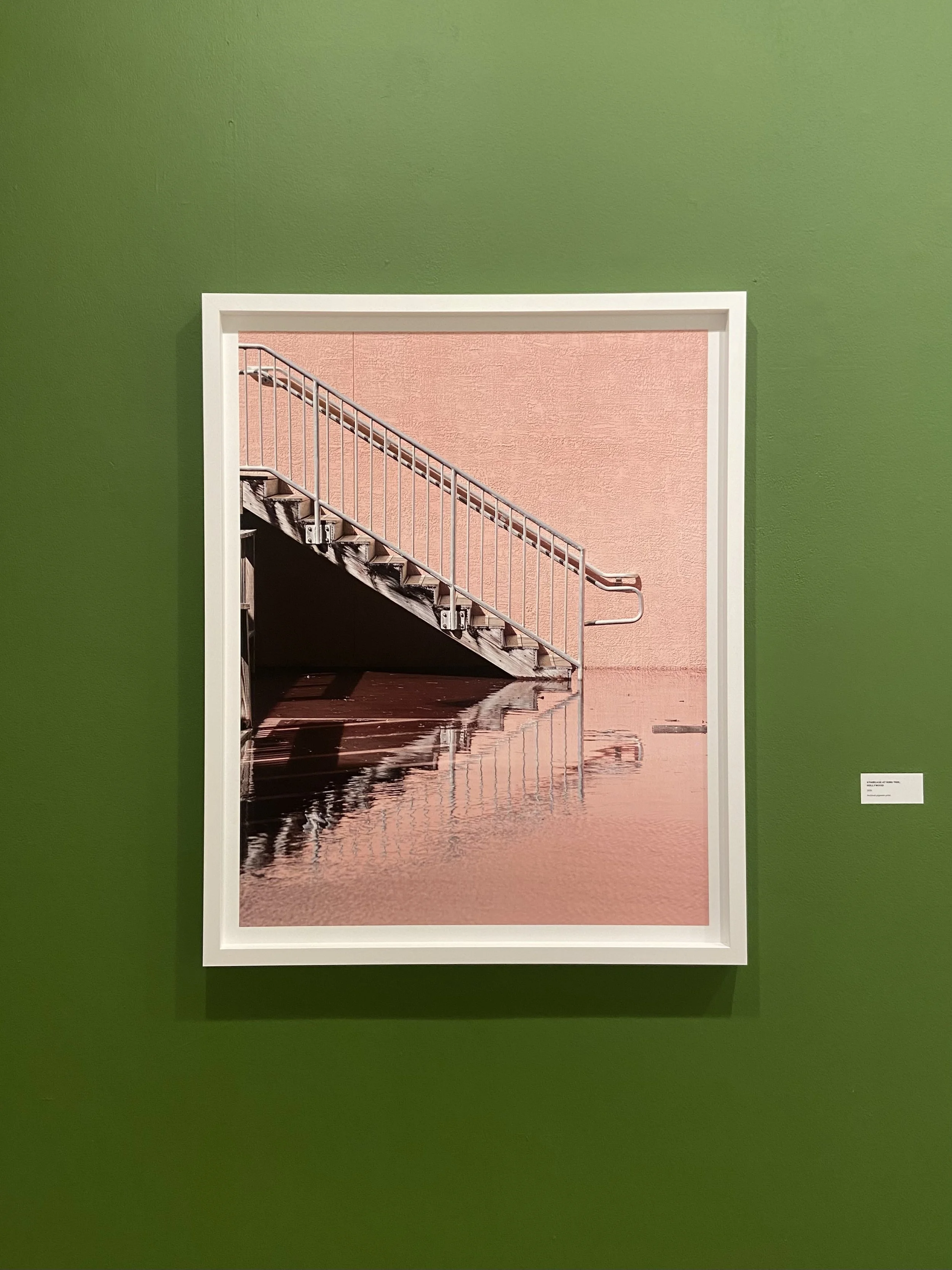

On the left is ‘Staircase at King Tide, Hollywood’. The image is a perfect soft pink, drawing the viewer into the piece, and shows a staircase submerged in water. The pink wall behind the staircase has a grainy texture, its colour reflected in the gently rippling water in the foreground. Against this softness, the sharp focus of the staircase draws your eye to the centre of the piece, its crisp lines reflected in the water, creating a clean geometric silhouette. The elegance of the image contradicts the devastation of the floods which have created this reflection.
On the right is ’The Tea Room, Vizcaya’. In this image, the photographer again captures an eerily peaceful depiction of the devastation of flooding. This time, the colour palette is nearly monochromatic, with the exception of the soft green architectural detailings. The subject is the tea room, a structure with intricate panelling and archways looking out towards the horizon lines. A layer of water covers the tiled pattern on the floor, casting crisp reflections, with the water level continuing out of the archways, eventually meeting the sky in a layer of grey stretching as far as the eye can see.
The quiet within the images in this series, mostly without the presence of people, shows the beauty of a world slowly being lost. For me, this representation of natural disaster has a much deeper impact than the graphic images we so often see on the news.
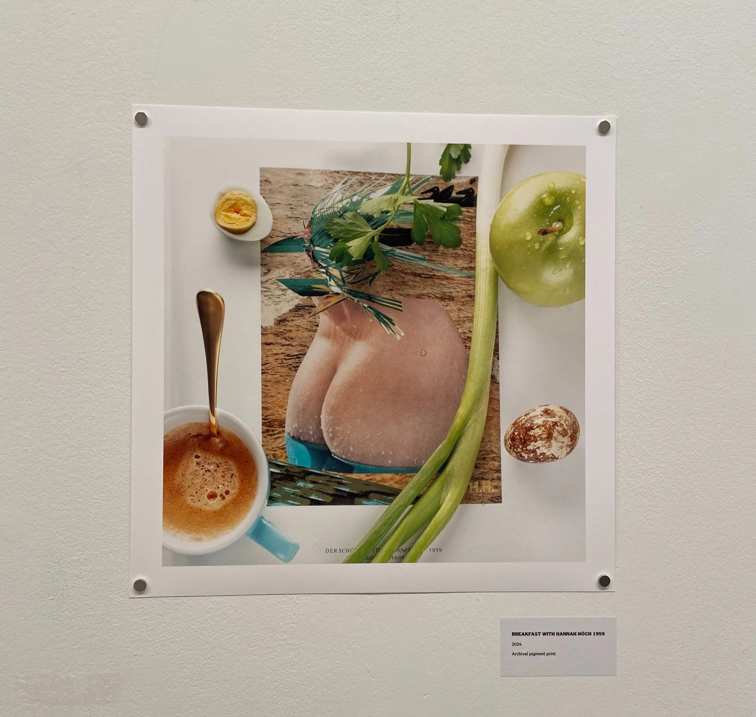
The room adjacent to this one is uplifting in its bright, playful displays. Here the two series’ ‘Landscape Sublime’ and ‘Breakfasts’ are displayed. These pieces feel less heavy in narrative, with more of a focus on process. ‘Landscape Sublime’ is a series of collages, comprising landscape photos taken across seasons in complex and distorting structures. A time-lapse video confirms that the artist constructed these three dimensional collages in real life, before taking the final photos. ‘Breakfasts’ is a series of 10 photos, displayed as unframed square prints along the wall. These images reflect the artist’s early mornings, where she finds peaceful moments with her breakfast to peruse books of photographers who inspire her. These images explore imagined interactions, showing food and coffee carefully placed over the pages. I particularly enjoyed the casual way the pieces have been displayed in the exhibition, inspiring a relaxed approach to viewing them and encouraging fun for the viewer as they notice small details within each piece.
The work of Anastasia Samoylova is a skilled combination of composition, narrative and colour. ADAPTATION is an excellent showcase of this broad selection of artworks, inviting the viewer to explore the stories hidden in these beautiful photographs, finding more depth the longer they look.
ADAPTATION is showing at Saatchi Gallery until 20 January 2025.
Creative Connection in Exhibitions
Exploring ways in which exhibitions can inspire comfort and connection with art.
Exploring ways in which exhibitions can inspire comfort and connection with art.
I was raised by artists, which meant that to witness art was never a passive experience. Paint was my first medium - I loved the texture and the process of working on a canvas. To see a painting in a gallery, from hundreds of years ago, I can almost feel the brushstrokes, the process and the thoughts of the artist as they painted. The fact that these things, created with natural pigments by normal people, have defied time and lived such long lives is like magic to me. The artists movements, immortalised for generations.
Over time, this connection has allowed me to feel confident in my thoughts and opinions of art. I can immerse myself and speak my mind without fear. To enjoy and understand art is easy.
I am aware that this is not an attitude shared by everyone. Lots of people are intimidated by this world. From the outside it can seem that there are rules - you must understand things and have the right opinion. I disagree with this. People should be welcome to experience art and think whatever comes naturally to them. However, it is not as simple as telling people to think and feel freely, so how do we encourage this? I believe this comes from exhibitions being an active experience, which blur the line between the viewer and the work.
WHY
Experiencing art can expand our lives in many ways, by introducing us to new perspectives and interpretations of the world. Art can be a tool for sharing ideas, communication, and documentation of histories and societies.
“Our technologies are tools. But our creative works carry the wisdom of the world.
Art is how we justify our existence.”
- David Zwirner, The New York Times
This article from the New York Times explains the importance of art to society. Creativity is so natural to humans, and often works of art contain messages, open to interpretation long after they are created. It highlights the communal experience of art, and how human connection can be found in these cultural spaces.
At a time when so much of life is dedicated to the digital world, exhibitions bring us the benefit of connection and engagement with the real world. It is physical, real and sociable.
The study of Neuroaesthetics has shown that artwork “engages flexible neural networks that are modulated by context, expectations, emotional states, goals, and experience”, explaining that the arts are the basis of our cultural identities. To create and appreciate art is in our nature.
So if this is the case, why is there so much threshold anxiety when it comes to exhibitions? Do people not enter these venues because they aren’t interested in whats inside, or because they don’t feel that the space is for them?
The intimidation that people feel towards the arts is a result of many factors, one of which is a fear of not having the ‘right’ opinions. While one way to combat this is with increased signage and digital interpretation, but this alone can risk adding to intimidation, and reinforcing people’s doubt in their own understanding. By considering an audience’s experience of the exhibition through the curation, you can anticipate how they will connect to the work.
In an interview with Kermode and Mayo, Celine Song, director of Past Lives, discusses her approach to directing her first feature film:
“I think that the other part of it is, this does reveal my theatre background, there is such room for the audience, there has to be room for the audience, to get to the emotional place themselves.” - Celine Song (Past Lives), Kermode and Mayo’s Take
From her background in theatre, Song is accustomed to creating for a live audience. In every step of the creative process, she thinks about how her work will be interpreted and the audience’s emotional response.
This consideration is something that can be applied to many things beyond film and theatre. With this in mind, I want to assess some of the exhibitions I have seen in the past year, and what elements have been successful in capturing my interest as a viewer.
WHAT
There are many ways that exhibitions can work to encourage an active viewer experience, with a few standing out as particularly successful. Some methods of engagement are:
Natural environments / Space: Bringing in natural light and textures can help people relax. This can take away the pressure of needing to understand the work, and reframe the exhibition as an experience of a space. This works best when the art and space compliment one another.
Multi-sensory / Physicality: Adding more senses to the experience can deeply increase peoples connection to artwork. Touch especially can break the boundary for a new audience.
Play / Participation: Physically engaging with the artwork draws you into the art in a way that is not only active, but also fun. Particularly in the context of fine art exhibitions which invite you to become part the artwork.
NATURE AND SPACE
A ‘white cube’ gallery is like a blank canvas on which to start a conversation. It can be a great way to highlight work and allow time for focus. However, it is a model that can occasionally feel isolated from the outside world. Considering the experience of the viewer, we can begin to reimagine ways of affecting their connection to art.
In Sensorium: embodied experience, technology, and contemporary art (edited by Caroline A. Jones), there is an essay titled Kinaesthesia by Zeynep Celik, which discusses the sense of bodily movement in experiencing art. Within this idea, the piece focuses on architecture, and the concept of space.
“Aesthetic experience was not simply a matter of enjoying forms from a distant fixed point; the body that entered architecture’s field of influence was shaken to its bones and stimulated throughout its muscles.”
The essay goes on to discuss the idea that experiencing art and architecture is a physical, multi-sensory experience. The artwork itself is not the only factor. It is also the environment within which it is displayed, and the way that audiences feel in this space will effect their experience of the art.
For example, by combining the ‘white cube’ model with natural light and earthy environments, a viewer can relate the work to the outside world, and thus their own lives.
David Kordansky Gallery in LA discusses the process of designing their space by “creating a constant interplay between inside and out” in an attempt to showcase art as something to be “engaged with, questioned, and related back to the life of the viewer.”
“By dismantling the logic of the white cube and allowing for a diversity of experience, art is relocated at the centre of life” - David Kordansky Gallery, LA
NORVAL FOUNDATION, CAPE TOWN
A beautiful example of a gallery considering space in curation is The Norval Foundation in Cape Town. This museum has several galleries which host an array of exhibitions, and a sculpture garden showcasing incredible artwork among the native fauna of South Africa. On a visit in March 2024, there where a few exhibitions open, with a diverse range of work on display.
Walter Oltmann: Metamorphosis


As you walk into the main hall of the gallery, you first meet ‘Walter Oltmann: Metamorphosis’. These striking silhouettes are displayed on plinths of varying height - ranging from 1 to 7 feet high. The physicality of the sculptures in the space means that as a viewer you have to move to see the art, standing on tiptoes and moving around the plinths to see sculptures initially obscured from view. Oltmann’s sculptures are human forms of insect-like body armour. The works draws inspiration from ancient Chinese burial suits, made using wire and beads. Otherworldly in their appearance, each piece is made up of carefully woven wire, using traditional techniques from African and Western cultures. Framed against large windows which look out towards the mountains of Cape Town, there is a striking juxtaposition between the artwork and the world outside.
Alexis Preller: Mythical Lexicon


In another gallery space is ‘Alexis Preller: Mythical Lexicon’. This retrospective showcases a substantial body of the artist’s work, following his life from 1911 to 1975. An exhibition that attempts to showcase a lifelong body of artwork faces a challenge in holding the audiences attention due to the sheer volume of work, particularly if they aren’t already familiar with the artist’s work.
Mythical Lexicon is captivating. The curation of the exhibition allows you to float between periods of the artist’s life, by separating out collections of themes and subjects in separate spaces, all leading off from a main corridor. Within this corridor is the piece ‘Collected Images (Orchestration of Themes)’ (1952) - an oil on canvas painting divided into 18 equal sections. Each section acts as an icon of a theme or subject from a period of his creative practice. The result is akin to a cabinet of curiosities of the artist’s mind. Displaying this in the central corridor allows the viewer to continually return to it, and connect what they have seen and read within this concise autobiography of a piece. At the end of the corridor, you step out into a high ceilinged hall, separated by angled panels, displaying larger later-in-life works. This space feels like a crescendo of the collection, bringing together the themes you have come to recognise. By the time you reach this vast room, you feel that you know the artist and his mind. There is a familiarity in the artist’s surrealist paintings and wooden sculptures.
Sculpture Garden


The Norval Foundation has an impressive collection of sculptural work displayed in the sculpture garden, which combines the dramatic landscape with the artwork. The artworks are positioned among vibrant levels of indigenous planting, against the backdrop of the cape mountains.
The combination of the natural world with these elegantly curated exhibitions allows the viewer to relax and take their time exploring the artwork. In another setting, the sheer volume of ideas might be overwhelming. However, the considerations of space and nature create an inspirational and thought-provoking experience.
MULTI-SENSORY EXPERIENCE
Introducing multi-sensory elements to exhibitions can increase audience engagement by physically crossing the boundary between viewer and artwork. For example, a ‘do not touch sign’ might increase the exclusivity of art, but having elements of an exhibition that people can touch can inspire them to feel that the artwork is for them, thus increasing connection.
Tavares Strachan: There Is Light Somewhere, Hayward Gallery


‘Tavares Strachan: There Is Light Somewhere’ uses smaller details to increase the sensory experience for the audience and increase connection with the artists narrative and themes.
Lots of Strachan’s work incorporates natural elements, for example Intergalactic Palace in which the floor was entirely covered in Iron Oxide. In this room the texture of the ground changes to a clay like texture, and is a deep earthy red in colour, which noticeably connects the different three-dimensional artworks together. In the centre is a thatched structure (inspired by those the artist saw on his travels to Uganda’s Kingdom of Buganda) in which there is the sound piece, ‘Sonic Encyclopedia’. In the corner of the room is a stool with a tile made from the dried Iron Oxide which people can touch, along with some pieces of straw like that used in the thatched structure.
Similarly, for the piece Jah Rastafarian with Rice Field (Staked with Pineapple, Shield and Football), a small bunch of the rice grass stems from the artwork are on a stool in the corner of the room, which people can pick up and feel. As with all of the artworks in the exhibition, an information panel explains the significance of this portrait and the symbolism of the various elements of it. The work itself is a ceramic sculpture of Haile Selassie I, the last emperor of Ethiopia, displayed in a field of Indian rice grass, laid out in the shape of a traditional African pictogram symbolising authenticity and excellence. In between this shape, you can stand among the rice, up close to the sculpture. The earthy tones of the ceramic, combined with the smell of the rice create a multi-sensory experience connecting you to the piece. For an artwork representing an important historical figure, adorned with symbolic imagery, the combination of the visual with scent and touch evokes the feeling of significance held by this artwork.
PARTICIPATION
Building on the use of space and senses, it is important to look at participation as a tool for connecting audiences to exhibitions.
Yoko Ono: Music of the Mind, Tate Modern


‘Yoko Ono: Music of the Mind’ is a collection of the artists work and ideas, celebrating key moments of her career. Yoko Ono is a great example of an artist who uses participation to energise and engage audiences. This exhibition invites you to realise her artwork in an active way, with the level of participation increasing as you move through the exhibition, evoking a sense of play.
Towards the start of the exhibition are pages of ‘instruction’ pieces, from Ono’s 1964 book ‘Grapefruit’. These simple directions invite the viewer to imagine the work themselves. At the time, this feels somewhat challenging, as though you are missing part of the puzzle. However, these directions act as a warm up activity for the mind, easing the audience into the rest of the work. Even these pieces were active in their expectation of the viewer by requiring you to use your imagination.
Progressing through the exhibition, the art draws the viewer in, inviting opportunities to play and entirely breaking down the barrier between artist and viewer.
In the next room is a screen showing ’Cut Piece’ (1964). This work pulls the audience sharply into the artist’s experience, seeing her brave vulnerability in this performance piece, in which she invited a live audience to cut off her clothing. While at times deeply uncomfortable, Yoko Ono has a gentleness in this performance that reflects the actions of the participants back at them. While purely being an observer in front of this artwork, there is a voyeuristic discomfort that makes you feel like more than just an onlooker.
"To ‘strip’, [Ono] explains, means ‘not to reveal to others’ but to ‘discover something hidden in humans’ and a ‘stripping of the mind’.”
- Exhibition Guide, Tate Modern
After this room, realised versions of the earlier ‘instruction’ pieces are introduced, which people are encouraged to add to. The work begins to invite the audience into the process, becoming physically active, with short actions to carry out.
As you progress through the exhibition, the participatory element of the work becomes physically larger. Near the end of the exhibition is ‘Add Colour (Refugee Boat)’, which began as a white boat in a white room. The instruction for this piece is ‘Just blue like the ocean.’ The piece invites people to reflect on the ongoing refugee crisis and consider the collective impact we can have. A week into the exhibition run the room was already covered in blue, with people colouring in, doodling in gaps they could find, leaving hidden messages on an already blue background. Having creative freedom with a simple direction, the room allows you to play. People stay for as long as they like, adding to the collective political message, having fun at the same time. You don’t have to think, you can just be. The room felt peaceful and optimistic.
Yoko Ono’s Music of the Mind is a powerful example of how an artist can consider the viewer’s experience by inviting active engagement. The result is an inspiring dialogue exploring the ideas and influence behind the work, combining these with our own lives and experiences.
The complexities of her activist movement work transcended time in a way that may not have been possible, had there not been such a physical connection to the work. It is an exhibition that ignites a full range of emotions.
Francis Alÿs: Ricochets, Barbican Gallery


Another exhibition that encourages playfulness is ‘Francis Alÿs: Ricochets’ at the Barbican Gallery, an exhibition showcasing the artists’ series ‘Children’s Games’. Instantly, the exhibition feels both chaotic and full of fun. The main gallery space consists of film installations of varying sizes showing children around the world playing games. Combined with sound installations and small paintings (these were lit with a single spotlight, mimicking the glow of a film screen), the dark gallery is lit up with images of play. Moving around with the help of the exhibition catalogue, you learn the various games created by children in different environments around the world.
A significantly important element of this exhibition is the ‘Playroom’. This is an empty room upstairs, with small round stools on wheels and a circle outlined on the floor. On the wall is the simple instruction
“You are very welcome to play with the low stools. Remember these are not for standing on, and please mind your fingers.”
When I got to this room I stopped for a while and watched a group of children enthusiastically playing on the stools. They were having the best time, with more children coming and joining. They were loud, laughing and chattering, their voices blurring with the sound installations, allowing them complete freedom to have fun.
I stood and watched, thinking ‘this is art!’
Our lives are rich with art in so many ways, with various art forms so easily accessible to us. Film, music, literature, we can so easily enjoy from the comfort of our homes. However, visual art and exhibitions still hold an importance. In their culture, social interaction, and physicality, they offer something different. For people who don’t naturally find comfort in these spaces, there are ways of encouraging connection with the work, which (if we’re lucky) could inspire a lifelong love of the arts.
Some effective considerations in doing this are space, movement, sensory elements and participation. Many excellent exhibitions utilise these to create a full audience experience, in fresh and exciting ways. Art is most powerful when it ignites a feeling in someone, and they find a connection to the artists intention.
Jojo Rabbit
The production and costume design behind Jojo Rabbit.
It’s rare to laugh so much in a war film. Jojo Rabbit is a film that follows the life of 10 year old Jojo Betzler through World War II. Directed by Taika Waititi, the story is both hilarious and heartbreaking. When I first watched the film, I was struck by how colourful it was. The world of Nazi Germany is bright and vivid, full of art and design and style. I had never seen a war film quite like it. The world created in Jojo Rabbit can be credited largely to Production Designer Ra Vincent, and Costume Designer Mayes C. Rubeo, along with Waititi himself. Below is a compilation of research I have done on the making of this film, along with some of my own thoughts.
Setting
In so many World War II films, the colour pallettes follow similar trends: muted, cool tones. Taika Waititi and Ra Vincent wanted to change this in Jojo Rabbit. In a story that sees the world through a child’s eyes, the film suited brighter, warmer colours. And Germany at the time was bright, following the Bauhaus movement. Vincent wanted the town to be saturated and bright, full of traditional baroque houses. He found Úštěk to be the perfect location, and decided to build Jojo Betzler’s house itself at Barrandov studios in Prague.
Due largely to the colour palette, the film begins with an optimistic, innocent feeling. This combined with Waititi’s comedic writing juxtaposes the darker themes of the story. I think this makes it resonate with the audience more. It allows you to let your guard down and feel strangely comfortable within a war film. Throughout the film, Jojo’s worldview changes, and since the film is seen through his eyes, so does the view of the film. The darker moments are added subtly, but in a way that hits that much harder, and stays with you for longer. The comfort of the film is felt mostly in the Betzler home. The interiors are stylish and warm, imitating the optimism of Rosie, Jojo’s mother.
In his interview with Deadline, Vincent explains the thought process behind the rooms in the Betzler home. I particularly liked the thinking behind Elsa’s hideout. The baroque architecture of the time usually included sharp sloping roofs, to allow snow to slide off them. This meant that if the houses were renovated upstairs, as was common around the second world war, false walls would be put in where the roof got too low to stand. This provided the perfect location for Elsa to hide, and meant it could be connected to Inga’s room. Jojo’s sister Inga passed away some time before the story, but her presence remains in her bedroom. This room was designed to be “a neutral staging area for Elsa and Jojo’s relationship to bond”. It is a room stuck in time, designed using more a more Victorian style, and relatively muted tones.
Wardrobe
Fashion is another thing that separates Jojo Rabbit from other war films I have seen. Mayes C. Rubeo designed the costumes for the film. Along with demonstrating the styles of the time and place, she uses clothing to add a connection to what is happening to the characters.
The most iconic element of wardrobe in the film is Rosie’s shoes. There is an emphasis on these throughout the film. From teaching Jojo to tie his laces, to dancing on walls at his eye level, the shoes are so often in shot. They are the first thing you see when you realise what has happened to Rosie, and the familiarity and distinctness of the shoes adds a real punch in the gut. Rubeo designed the shoes herself, and had them custom made for the film.
Elsa’s wardrobe contrasts strongly with Rosie’s. She is shut in her hiding space, and has been stripped of her freedom by the war. Her outfits are plain and monochromatic, up until the final scene, when the war ends and she can step outside. She’s wearing shoes for only the second time in the film, which Jojo poignantly ties up, and she has a bright green jacket on. I think this outfit choice is deliberate, to add an element of hope and relief.
Yorki’s outfits took a lot of work in the film. Yorki is Jojo’s best friend, and holds a particular innocence. Unlike Jojo, he doesn’t hold the same admiration for the movement, and just seems to be obliviously moving through the ranks, from the Hitler Youth, up to an official soldier. In the beginning of the film, emphasis is put into the uniforms of the Hitler Youth, smart and each equipped with their own knife. By the end of the film the uniform has changed dramatically, with the boys noting that it is made of paper. As the final battle scenes progress, each time we see Yorki, his uniform is becoming quickly more and more damaged. For this, Rubeo had six versions of the outfit, made using paper, cardboard and cotton. By the end of the war, he sits in his vest - “by the end, when we find him again, he’s got nothing left”. He says he’s going to go home and hug his mum, reminding you that he is really just a little boy.
Another outfit I loved from the film was Captain Klenzendorf’s final battle outfit. I think Klenzendorf is controversial and there is a complexity to his character. An article from Medium states that the importance of Klensendorf and Freddy Finkel was their gay relationship. While not overtly noticeable, there are intentional signs throughout the film showing their closeness. In concentration camps, those imprisoned for homosexuality were forced to wear pink triangles on their uniforms. In the final battle uniforms, designed by them, the couple’s uniforms have pink triangles on them, adding to this final moment of self expression and rebellion.
I think Jojo Rabbit is a film with many layers of complexity, and little details in the setting and costumes really tie the story together. Every aspect comes together so elegantly to tell a story that holds real importance.
People of significance:
Taika Waititi, Director
Ra Vincent, Production Designer
Mayes C. Rubeo, Costume Designer
The Queens Gambit
The production design behind The Queens Gambit.
When I watched The Queen’s Gambit, I felt inspired by the beauty of the show. A month after I first binged my way through it, I decided to channel this inspiration into some research. This document is an account of what I found through this research, alongside some of my own opinions about the show.
Anya Taylor-Joy is an extremely talented actor, but it was the use of wardrobe and setting that really caught my attention. Beth Harmon (played by Taylor-Joy) is a calm and detached character, and this is reflected in her expression. She feels most like herself on a chessboard. It is where her mind works best, and is a place of comfort. This is represented in the geometry and structured patterns in her personal style. This is shown in the first dress she falls for, or when she tears down the curtain in her house, to redecorate in her own style. It is small details like these that I adored about The Queen’s Gambit.
Composition
The Queen’s Gambit revolved around Beth Harmon, from a young age at Methuen House, to being adopted by Alma and moving to a suburban home, onwards through her developing chess career. Throughout this, the story is seen from her point of view. According to an article in Vulture, cinematographer Steven Meilzer showed her perspective by frequently using Beth’s head in the foreground, inspired by Jonathan Glazer’s 'Birth'. A shot was first shown with her head in the foreground, before closing up on her.
Objects and locations were also used as “emotional walls”. For example, Beth’s emotional wall was the staircase, while Alma’s was her piano. Early on in their relationship, they are shown with these very physical divides between them.

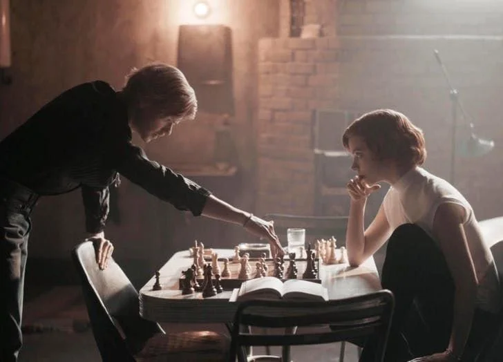
Chess
In the show the chess board plays a crucial role. It is the centre of Beth’s world. However, it is difficult to demonstrate the intensity of a chess game with this alone. The biopic ‘Pawn Sacrifice’ suggested that the chess board didn’t always have to be on show during a match. This resulted in much of the game being portrayed by the characters, in their facial expressions. This was assisted particularly well by the performance of Anya, and her expressive face, and the result are fierce at times.
Interiors
Home
There is a contrast between Beth and her adoptive mother, which is demonstrated clearly in their respective styles. Beth’s style is very modern and geometric. She utilises flat colour, and is fashion conscious, aware of what styles work. Her mother, Alma, however, prefers very kitsch, stuffy styles. The contrast is clear when Beth moves in, and looks at the many many animal pictures around the house. This is mirrored later, when she redecorates the place, and can be seen boxing these animal pictures up. Similarly Alma likes a bold and fluffy floral, as shown in the explosion of wallpaper and bedding in her room. Again, this is not to Beth’s taste, shown when she tears the lace above her bed, so as to see the plain ceiling, which is her canvas for the chessboard in her mind’s eye.
Insider explains that the extremity of mid-century modern patterns and fabrics in the Wheatley’s home is intended to show the troubles of Almas life, as if she is overcompensating in attempt to portray a sense of happiness. The production designer, Hanisch, explains that it was intended to portray a “facade of a happy home”, inspired by things she’s seen in catalogues. Beth's bedroom dotes a similar style, intended to create a visual barrier between the pair. It was described by Hanisch as the shows strongest use of set design for storytelling. It shows Alma’s desire for a young daughter, and was intended to show her attempt at creating a ‘girly’ room. The explosion of pastel pink, and the textures and patterns around her room were intended to create a sense of Beth being trapped: “she’s like a super smart animal caged inside a powdery marshmallow box”. What’s more is that her bright red hair clashes with the decor, much like her and Alma’s personalities.

The contrasts between Alma and Beths tastes are evident from the start, regarding both fashion and lifestyle, with Alma being disproving of Beth’s lack of interest in ‘normal’ social activities. However, this only makes their relationship ever more endearing. Despite the two coming from entirely different backgrounds and differing world views, they grow to be the most important person to one another.
In Beth’s remodelling of the house, she uses colours and styles similar to those used by Alma, but with more geometric patterns, and a minimalistic tone. The pastel blues and pinks, similar to those worn by Alma, create a soft backdrop, and are tied together by teal features. Furthermore, they conserve the mid-century modern style.
Methuen house
Before getting adopted, Beth grows up in the orphanage, Methuen House. The colour scheme at the orphanage revolved around a petrol blue, with these scenes filmed at a castle on the outskirts of Berlin. Insider explains how CGI was used in parts, to gain the desired feel, so that it had a less medieval style. This was shown clearly in the tower, which is changed to appear more alike the rest of the building’s facade.

Hotels
In Beth’s many travels, she moves from hotel room to hotel room, with each one capturing an essence of the city within which it was set. Since the filming was done largely in Berlin, Hanisch and Schaaf had to be more creative about showing the 60s on a global scale, through the lens. They opted to show the biggest cliche of each city. Hanisch described the deliberation behind this, explaining how the colour schemes of each one differed so as to create the contrast (4). The Las Vegas room, for example, uses turquoise and gold, with large patterns, such as the dice on the mirror, intended to feel “gaudy”. Comparatively, the Paris room was intended to “play as French and pompous as possible”. Lots of gold trimmings adorn the room, with much more detail and intention than in the Las Vegas room. This is paired with expensive looking patterns and textures.
There are special references to art throughout The Queen's Gambit, with even the paintings having thought behind them. Hidden in the luxurious hotel room in which Beth stays in Paris, is a painting of the female form, says The New Yorker. Hanisch explains that the paintings were intended to “give her to company of other strong women”. It is a comforting thought, that while Beth is in an extremely male environment, navigating her way through it largely on her own, that she has these empowering figures hidden on the walls, almost as if they are keeping her company.

Russia
At the end of the series Beth makes it to the tournament in Russia, where she plays the Grandmaster. In the scenes of these tournaments, Berlin’s City Hall was transformed into a Temple of Chess. The building itself consisted of 62 feet of floor to ceiling marble. According to Insider, the intention was to give the viewer a sense that they were watching a chess match through a chess match, with the onlookers on tiered seating, and a monochromatic pallet. With Beth at the centre of it all, it gives a sense that she is in total control.
Furthermore, The New Yorker explains how the importance of the hall in Moscow was to show the importance that chess held here. It positions Beth, not only at centre of this room, with the audience looking down at her, but also in the centre of the capital of Chess. Even the chess pieces were carefully selected to show the exclusivity of this tournament. Her red hair and striking complexion are particularly noticeable here, creating a huge contrast between her and every other player in the room. Successfully, this gives the impression that the eyes of the world are on her in that moment. This intimidation, and her response to it, demonstrates the extent of her growth as a character.
Clothes
Throughout The Queen’s Gambit, Beth’s wardrobe plays a crucial role in showing her personal growth. Right from the beginning, it represents her position and the control she has in her life. This is outlined well by the moment when she arrives at Methuen House and has to give up her dress, embroidered with her name, in exchange for a monotonous uniform. This strips her of her individuality, by literally removing her from her name.

A large aspect of her character is her battle for control. It is a large part of her attachment to chess, and within the constraints of the 8x8 grid she feels comfortable. As the series progresses her control resides in other things, such as alcohol, and particularly her wardrobe. As a child she is restricted to her uniform, and even in episode two she is dressed in ‘unfashionable’ dresses by Alma. This changes after her first tournament win, with her buying a plaid dress that takes her fancy, and from that moment on, she regains her identity with a style that defines her. As she improves at chess, her style becomes more her own. As if the more she plays, the more she gains her own identity and regains control. An article from Vogue points out that the fabrics Beth chooses are all very simple and geometric, with lots of linear patterns and checks. This was a deliberate decision to reflect the chess board. Every piece is beautiful and elegant, and put together with a thoughtful eye. While this demonstrates Beth’s interest in fashion, this thought is credited to Gabriele Binder, the show's costume designer.
The final scene shows Beth in total control. Having defeated the previous Grandmaster, she walks through a park in Moscow. She is wearing a tailored white outfit, including a long white coat and a white beret, an outfit that very clearly resembles the chess queen piece, intended to show her dominance and control over the world of chess.

People of significance:
Scott Frank, Director
Steven Meizler, Cinematographer
Uli Hanisch, Production designer
Sabine Shaaf, Set designer
Gabriele Binder, Costume designer
All images used are screenshots from The Queens Gambit, Netflix, and have been sourced online.